Joining an Ad Campaign

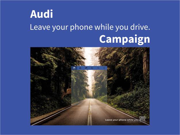
For this assignment, I had to find an ad campaign and create a new ad, using Adobe Photoshop or Illustrator, that would fit in with the original campaign. I was then required to create 6 or more consistently designed slides (including transitional slides) to present my new ad and show how it fits in. The original ad needed to be well designed, have at least one line of text, and include the company logo. The new ad needed to match the original dimensions and look like it was from the same campaign. No copying and pasting of elements from the original ad was allowed. I found Audi’s “Leave your phone while you drive” campaign.
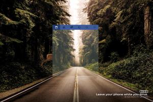
 

Original Ad

Audi Ad. Leave your phone while you drive.


Original Design

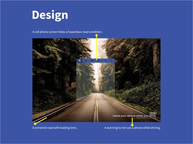
The original ad has a centered road with leading lines that take your eye to the end of the road. You then notice the cell phone screen over the road and the deer’s hind quarters on the side. The implication is that an accident is about to occur because the driver was looking at his phone. In the lower right corner is a warning not to use your phone while you are driving. We also see the logo and a smaller message from Audi.

Audi Ad. Design.


Original Typography & Color

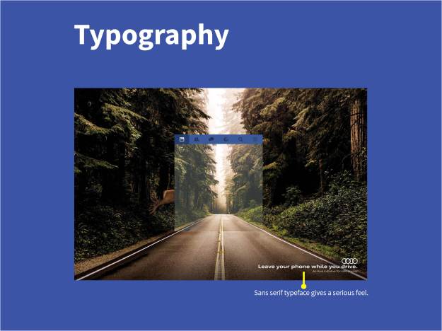
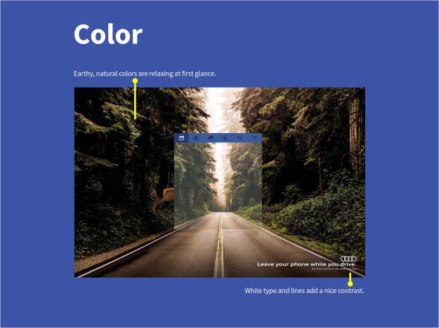
In the original ad, the typography is a sans serif font, which lends to the seriousness of the warning. The white matches the lines in the road and ads contrast. The colors in the image are earthy and natural and feel calm and relaxing at first glance.
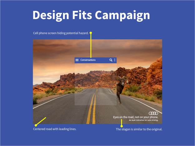
Audi Ad Typography

Audi Ad Color


New Ad Design

For the new ad, I found an image of a centered road with leading lines surrounded by nice scenery. I copied the text messaging screen on my phone for the cell phone image. I chose a big horn sheep because the image reminds me of the Arizona desert.  I had to recreate Audi’s logo and my new warning message fits in with the original campaign. Here is a link to Audi’s official website.

New Ad Design


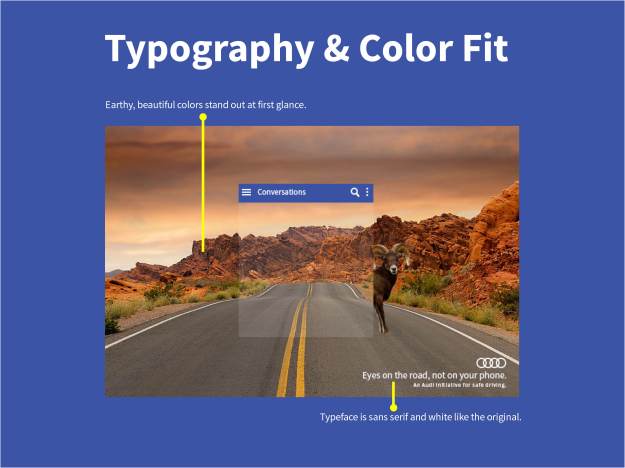
New Ad Typography & Color

I used Source Sans Pro regular for the font because it looked similar to the original ad. The typography is white and the image has earthy colors that follow the theme of Audi’s campaign.

New Ad Typography and Color


Conclusion

I had a hard time finding an ad to work with and I was excited to come across this Audi campaign. I knew it would give me the chance to use some of the skills I’ve learned in Photoshop. Audi has two other ads in this campaign. In one, the road curves, but the driver sees it going straight over a cliff. The other one has the driver crossing a railroad track and not seeing that the crossing bars have come down. I think my ad fits in nicely.


Images Used

Audi Ad
Audi – Leave your phone while you drive.


Desert Road
Valley Of Fire / maxpixel.freegreatpicture,com


Big Horn Sheep
Photo by Gary Migues / justfunfacts.com

Thirds, Lines, and Fields

Yellow Flower

Great photographers know some tricks that the average guy with a camera
would do well to imitate. This post will explore three of them: The Rule of
Thirds, Leading Lines, and Depth of Field. I found beautiful examples of
each on the National Geographic website. I can’t jet off to New York to find
the perfect, picturesque scene, but I did my best, around my own area, to
mimic the style and photographic element (trick) used in each photo.

Rule of Thirds

National Geographic Photo
This photograph was taken by Michael Medford in Adirondack Park, New
York, for National Geographic. It’s featured in a photo gallery to “Celebrate
the Arrival of Fall.”

National Geographic Rule of Thirds
Mr. Medford is utilizing the Rule of Thirds. The most obvious is the horizon
which lines up across the top third of the picture. The lake and the mountain
peak are right on the left vertical line and both are close to the intersections of
the top and bottom third lines.


My Turn (Rule of Thirds)

Water Fall
I went to Municipal Park, Boise Idaho and tried taking my own photo using the
rule of thirds.

Water Fall with Grids
Here I lined up the waterfall on the right vertical line of thirds and the driftwood
on the intersection of the lower horizontal and right vertical lines. I also tried to
have the closer rocks fill the lower third of the photo.


Leading Lines

National Geographic
Here is another photo by Michael Medford for National Geographic, this time, in
Acadia National Park, Maine.

Leading Lines Draw Over
The photographic element that stands out most is leading lines. The pathway
through the trees draws your eyes all the way to the end of it.

My Turn (Leading Lines)

Bridge
This bridge/pathway is also in Municipal Park in Boise, Idaho. It felt like the
perfect spot to try a photo with leading lines.
Bridge Leading Lines
The railings on either side of the pathway draw your eyes to the end. You might
focus on the rope or follow the next set of railings around the corner.


Depth of Field

Canoe of Water at Night
This final picture by Michael Medford, which is featured on National Geographic,
was taken on the Allagash River in Main.

Canoe of water at night draw over
The photographic element demonstrated here is Depth of field. The canoe is the
first object you see. When you look beyond the canoe, you see the water leading
up to the trees and finally, the moon behind some clouds.


My Turn (Depth of Field)

foliage around water
I took this photo at Eagle Island Park in Eagle Idaho.

foliage around water draw over
I tried to imitate the look of Mr. Medford’s photograph. Instead of a canoe, I
had to settle for some tall grass. Beyond the grass is some organic debris in
the water. Next you might notice the reflection of trees and shrubs in the water
leading up to the actual foliage.


Summary

Professional photographers utilize many tips and tricks that result in beautiful
photography, but remembering just the Rule of Thirds, Leading Lines, and Depth
of Field, while snapping photos, might help the rest of us to look like we know
what we’re doing.


Typography and Lobsters

Red Lobster Ad

This add was on a website called TV Commercial Spots. The site does not give any information
about who created the ad, but it is listed under their section for Red Lobster. I found an article
from 2014 on AdWeek.com reporting that Red Lobster had “named Publicis Kaplan Thaler as its
lead creative agency.” I can not verify that they are the ones responsible for this specific ad.


Slab Serif Typeface

Red Lobster Ad Draw Over
The first typeface on this ad falls in the slab serif category. Slab serif typefaces can
be recognized by their thick block-like letterforms with little to no thick/thin
transition. The serifs on this typeface are as thick as the rest of the letterform.


Sans Serif Typeface

Red Lobster ad san serif draw over
The second typeface on this ad is from the sans serif category. The most obvious
clue is that there are no serifs on any of the letters. Also, all of the letters are the
same thickness with no thick/thin transition.


Contrast

Red Lobster ad contrast draw over

These two typefaces provide a nice contrast for this ad because they are from two
different categories that work well together. One has serifs and the other does not,
so they are seen as separate and distinct. Even though both typefaces use all capital
letters, the slab serif is set at a larger font size making the contrast more obvious.


Conclusion

Most of the ad space is taken by images of food with a dark gray background. The
large, white, slab serif  lettering, set in an arch over smaller, straight, white, sans serif
provides great contrast for the entire ad.


Dissecting the Alignment of a Pear

I found this ad on a website called Grocery Headquaters. The article was called “Pear Bureau Northwest Launches Fresh Consumer Ads” and was written by Elizabeth Louise Hatt. The ad was created for the Pear Bureau Northwest to promote the consumption of pears with particular emphasis on how to tell when they are ripe.  It ran in several food magazines from October 2014 to the end of February 2015. The add uses bold, striking colors to draw the viewer in and plant the idea that pears can be as sweet as ice cream.


Proximity

USAPears Want it Sweet ad

The designer used the principle of proximity by grouping the lines
of text that are closely related. For example, the question, “Want it
sweet?” is answered with the suggestion in the line that follows.


Alignment

USAPears Want it Sweet ad Image showing alignment

The alignment of the words and image are obvious and deliberate.
Even if center alignment should generally be avoided, it works well
to have the centered words line up with the width of the pear. The
paragraph at the bottom is left aligned and fits perfect with the
logo in the opposite corner.


Repetition

USAPears Want it Sweet ad Image showing repetition

This design uses repetition with color where the green in the image
matches the green in the logo. The yellow in the background is
repeated in the text and the cone. There is also repetition in the
bold lettering.


Contrast

USAPears Want it Sweet ad Image showing contrast

The dark red background is a strong contrast for the yellow cone
and text. The green pear also stands out nicely from the bright
yellow behind it. There is contrast in the text as well. The bold
lettering and larger font in the text directly below the cone grabs
your attention. In fact, I still haven’t read the smaller lettering.
Finally, the contrast of the green and white coloring and cursive
font of the logo draws your eyes to the bottom right corner.


Conclusion

The center alignment of the image, with the bright contrast of
a yellow halo-like glow, was a perfect choice to grab a viewers attention.
Although center alignment with text can appear amateurish, it
comes off as intentional because of it’s proximity to the image and
alignment with the edges of the pear. The yellow color in the text,
the cone, the background, and the pear itself was a great way to
bring in repetition.